

Project Overview
Enhancing the Donation Experience for Second Bind.
What influences your decision to donate to an organization? What elements on a donation website encourage you to support a cause?
I discovered Second Bind's donation website and love their free pickup service for recycling unwanted items. I've identified key areas for improvement:
UX Improvements: Reduce clicks to complete the donation pickup process quickly.
UX Content Arrangements: Improve the placement of key content to encourage donations and enrich the content to attract more contributors.
UI Enhancements: Modify colors, graphics, and add button interactions to make the site more engaging and interactive.

I conducted user interviews and usability testing to understand donor motivations and pain points. Using these insights, I redesigned the website to better meet donor needs and improved the content for greater engagement. The revamped site aims to make donating easier and more appealing.
Key Improvements Made
1. UX Improvements: Reduced Clicks in Pickup Scheduling Process
2. UX Content Arrangements:
-
Relocating the “Where Your Donations Goes” and “Simplify The Donations For All” Section
-
Added Organization’s Commitment Details and Donor Impact Stories
-
Improved Section Titles for Enhanced Storytelling
3. UI Improvements:
-
Updated Graphics
-
Color Variations
-
Button Interactions
The Goal
Improving UX/UI and Fostering a Sense of Community in Donations.
The goal of this project was to enhance the Second Bind donation website to encourage more people to contribute to their cause. By improving the user experience (UX), which included content restructuring, enrichment, and other usability enhancements, along with refining the user interface (UI), the project aimed to create a more engaging and user-friendly platform. Ultimately, the objective was to make the donation process easier and more appealing, fostering a stronger sense of community among potential donors.
Research Method
Applying user interviews and usability testing.
To uncover the current issues with the Second Bind donation website, the research process involved two key methods:
User Interviews
In-depth interviews were conducted with potential donors to understand their motivations, preferences, and pain points related to online charitable giving.
Usability Testing
To validate and expand on the insights from the interviews, usability testing of the existing Second Bind donation website was performed. This involved observing potential donors as they navigated the site and attempted to complete a donation, noting areas of confusion, difficulty, or abandonment.
User Interviews
Importance of Impact and Motivation Through Transparency.
I conducted interviews with two target users who are frequent donors, regularly contributing their unwanted items to charitable organisations.
Key Questions
-
What initially motivated you to start donating your unwanted items?
-
Can you walk me through the steps you typically take when donating items?
-
What specific information do you look for or find most important when considering donating an item?
-
What are some things that would make you more likely to donate items on a regular basis?
Highlighted Insights
1. Importance of Impact: Participants prioritize understanding the organization’s impact and accomplishments when choosing which charity to support.
2. Motivation through Transparency: Knowing where their donated items will go significantly motivates participants to donate more frequently.
Journey Map
.png)
Usability Testing
Donor's Desire for Detailed Impact Information & Trust Through Transparency.
Next, I conducted two usability testings with the target users to find out the possible issues of the current website.
Tasks Assigned
-
Please find the information on this website about what types of items or donations are accepted.
-
Can you find information on this website about the environmental impact or benefits of donating items?
-
Try to find where on the website it explains what happens to the donations and where they go.
Highlighted Insights
1. Desire for Detailed Impact Information: Participants expressed a strong interest in understanding the specific impact that Second Bind has made, rather than just seeing numerical data. They want to know how their contributions make a difference.
2. Trust Through Transparency: Users indicated that having clear information about "where do donations go" prominently displayed on the homepage would enhance their trust in the organization. This transparency could significantly influence their decision to donate.
Highlighted Improvements Made
Enhance the Donation Experience: Streamlining UX, Enriching Content, and Revamping UI Elements
UX Improvement
-
Reduced Clicks in Pickup Scheduling Process

Originally
The hero section featured two buttons: "Schedule a Pickup" and "Drop-off Location." Clicking "Drop-off Location" took users to a separate page with an address and Google Map link, while "Schedule a Pickup" required entering a postal code on another page.
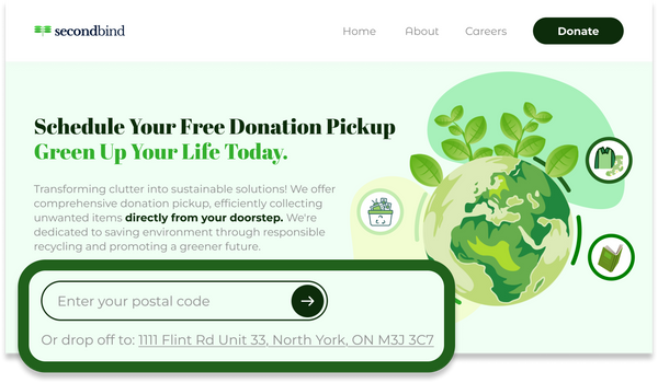
Changed To
To streamline this, I replaced the buttons with a single input field for entering the postal code directly, expediting the scheduling process. I also added the drop-off address below the input box, linking to Google Maps for easy access.
UX Content Arrangements
-
Relocating the “Where Your Donations Goes” and “Simplify The Donations For All” Section
To attract more donors, it's essential to inform them about where their donations go. Insights from interviews revealed that users consider this information crucial. Originally, both the "Where Do Donations Go?" section and the "Simplify The Donations For All" details were tucked away in each "What Can You Donate?" category.


I relocated these sections to the homepage to enhance visibility. Additionally, I emphasized the "Simplify The Donations For All" information, which provides accessible solutions for seniors, families, and businesses, making it easier for potential donors to understand how they can contribute.
-
Added Organization’s Commitment Details and Donor Impact Stories
From usability testing results, participants expressed a desire for more detailed information about the impact Second Bind has made, rather than just viewing numbers in the "Our Commitment" section.

In response, I added a "Learn More" link under each commitment, directing users to more comprehensive information.

Additionally, I introduced a "How Donors Made an Impact" section, featuring true stories that illustrate how previous donations through Second Bind have positively affected society and individuals in need. This enrichment aims to engage potential donors by highlighting the real-world effects of their contributions.
-
Improved Section Titles for Enhanced Storytelling
To foster better storytelling on the donation homepage and attract more donors, I revised the wording of each section. The original titles were somewhat generic and did not fully convey the impact of donations or engage potential contributors. By rephrasing the titles, I aimed to create a more compelling narrative that resonates with users.

Original Titles:
-
Free Donation Pickup - Green Up Your Life
-
Our Impact - Our Commitment to the Environment
-
Donate More - What Can You Donate?
-
Plant Trees - Want to Contribute More?
New Titles:
-
Schedule Your Free Donation Pickup - Green Up Your Life Today!
-
How Do Donations to Us Help the Planet? - We're Committed to the Environment!
-
Schedule Your Free Donation Pickup Today - What Can You Donate?
-
Transparency in Our Commitment to the Planet - Where Does Your Donation Go?
-
We Promise Hassle-Free Ways for Donors - Simplifying Donations for All
-
Learn More About Our Donation Success Stories - How Donors Made an Impact
-
Don’t Stop Here - Want to Contribute More?
These new titles aim to create a sense of urgency and connection, encouraging users to take action while clearly communicating the organization’s mission and the significance of their contributions.
UI Improvements
-
Updated Graphics
Replaced existing graphics with more appealing and relevant visuals to capture user attention.

-
Color Variations

Incorporated a vibrant palette of greens to make the page more visually interesting and aligned with the organization’s mission.
-
Button Interactions
Added interactive button elements, which were previously missing, to improve user engagement and navigation.

Self evaluation
How I Can Improve Next Time
Due to the project's limited scope and resources, I was unable to conduct extensive user research and usability testing. In future projects, I plan to:
1. Broader User Research: Conduct interviews with a larger and more diverse group of donors to gather a wider range of insights and perspectives.
2. Iterative Testing: Implement more rounds of usability testing throughout the design process to identify and address issues earlier, ensuring a more refined final product.
3. Enhanced Collaboration: Given my marketing background, I realize how important this aspect is. I plan to work closely with marketing and communication teams to gain additional insights on effectively conveying the organization’s message and impact.
By focusing on these areas, I aim to create more effective and engaging experiences for users in future projects.